

Why configure Dynamics 365 Interactive Dashboards?
I look forward to the opportunity to create an Interactive Dashboard in Dynamics 365. Although they are quickly and easily configured, they look and perform like they took hours of our time! Admittedly, you won’t be able to provide the flexibility and functionality of a Power BI dashboard, but those features aren’t always required. The out of the box capabilities of interactive dashboards are often enough to provide great value. Even if your users don’t request an interactive dashboard, throw one together to demonstrate the power of Dynamics 365. Now that I have created a variety of interactive dashboards for a variety of industries, I have a few of my own personal best practices that I’d like to share.
Templates to get you started with Interactive Dashboards
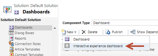
To create a new interactive dashboard, from a solution, select Dashboards on the left. Go to the New button dropdown list and select “Interactive experience dashboard”.
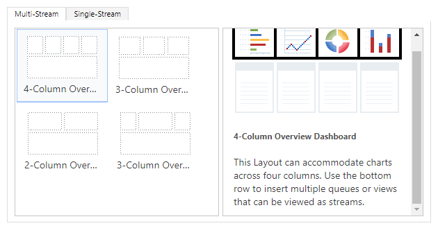
There are multiple templates available in to get you started with your interactive dashboards. The multi-stream dashboards display real-time data over multiple data streams, which are simply views. Each stream or view can be based on a different entity. The single-stream dashboards display real-time data over one stream or view. Both multi-stream dashboards and single-stream dashboards display charts that also function as data filters. For the purpose of this blog, I’m going to concentrate on single-stream dashboards.
Interactive Dashboards for Opportunities
Most companies obviously pay close attention to the status of their sales opportunities. Interactive dashboards are a perfect tool for them to accomplish that. I recommend creating an “overview” interactive dashboard for all opportunities. Another interactive dashboard can be configured to do analysis on just the open opportunities. Because the data categories of interest will most likely be different for each group of opportunities, you can develop a unique and optimum design for each dashboard. In this blog, we will dig into the details behind the “overview” type of dashboard.
Opportunity Overview Dashboard
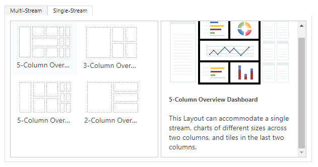
For the “overview” type of dashboards, I always choose one of the 5-Column Overview Dashboard templates. (The dashboard being featured in this blog is using the 5-Column Overview Dashboard II template.) After the dashboard form opens, give your dashboard a meaningful name and select the Filter Entity. Next, you need to select the Filter By date. You have the option to choose any of the Filter Entity date fields. In most cases, the Created On date works well. The Filter By date is the primary date filter and the date used by the selected default Time Frame. There are lots of choices for the default Time Frame (e.g. Last week, This month, Month To Date), but I like to use “This quarter”.
Streams and Charts
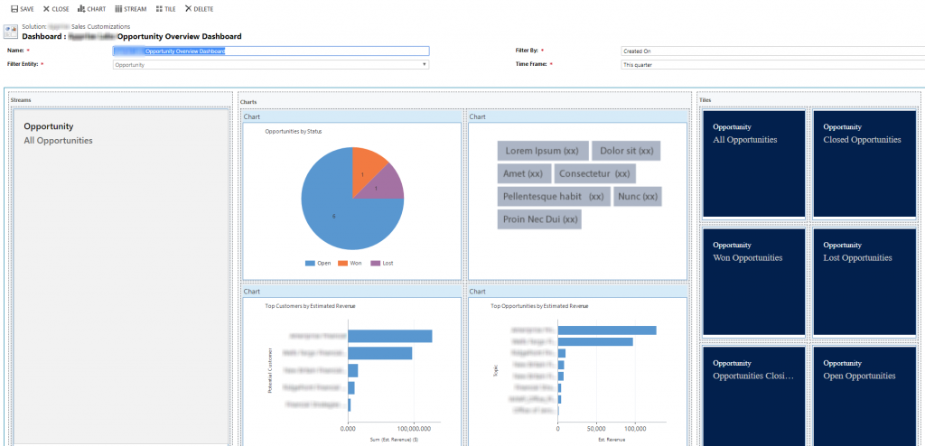
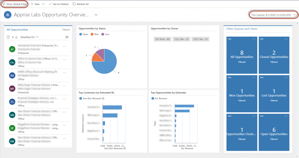
I recommend using the entity view that lists “All” entity records as the one stream or view that will be displayed in this dashboard – in this case, All Opportunities. Now you need to think about the charts you want to use as filters. There may be one or more out of the box charts you can use. In the example below, Top Customers by Estimated Revenue and Top Opportunities by Estimated Revenue are both out of the box charts. The charts that I consider to be standard on an “overview” dashboard are the “by Status” and “by Owner” charts. You can configure them to be one of many different chart types. If you want to add a fifth chart, select the 5-Column Overview Dashboard template.
I think a pie chart works well for Opportunities by Status. Or, you may find more value in Opportunities by Status Reason. Our users had 12 Status Reasons defined, which I thought would be too many for a filter chart. So instead, I made Status Reason a Global Filter. More about Global Filters later in the blog. Tag charts are relatively new in Dynamics 365. I like to use a tag chart for Opportunities by Owner.
Option Set Color Codes
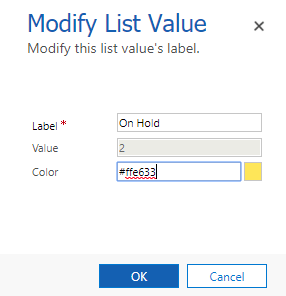
If you create some custom charts based on an option set field, remember to configure your option set values with different colors. I think an interactive dashboard that has some color is more appealing and makes it easier to use. If you google this, you will find that in data visualizations, the importance of color is not just aesthetics – it also conveys meaning. You could make your color selections a project in itself! But, I just google “HTML color codes” to find the color codes that I think are appropriate for my chart. You simply type, or copy and paste, the color code into the option set value Color field.
Tiles
The tiles, which are also based on views, are the dark blue boxes positioned on the right side of the dashboard. Each tile offers a count of the opportunities within that view. This is great for a quick overview of how many opportunities are in each category. For Opportunities, there are many out of the box views to choose from. I will show you how tiles work later in the blog.
Save and Publish
When you are satisfied with your configuration and are ready to test it out, click on SAVE at the top and close the dashboard form. If you are adding it to a model-driven app, you may need to add the dashboard to your app and publish it. Next, publish your solution and test out your new interactive dashboard.
Check Out Your Interactive Dashboard
Navigate to Dashboards and open your new interactive dashboard to check it out. This particular dashboard is using test data, but you could imagine how it would look with a lot more data.
Time Frame
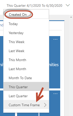
It is important for users to understand that the interactive dashboard opens using the selected default time frame. If the user clicks on the down arrow next to the default Time Frame, they will see many other out of the box options for the date filter. “Created On” is displayed at the top of the drop down list as a reminder that this is the Filter By date for this interactive dashboard. There is an option for a Custom Time Frame. If the user selects this option, they will be able to enter a Start Date and an End Date. This provides a way to limit your data scope to accommodate your custom time frame requirements. Unfortunately, you can’t set the Custom Time Frame to be your default. The Custom Time Frame needs to be reset each time you open the interactive dashboard.
Global Filter
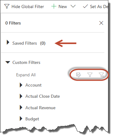
As previously mentioned, there are additional filter capabilities in the Global Filter. There is a Show Global Filter button at the top of the interactive dashboard. Here, you will find additional field filters (e.g. date fields, option sets, numeric fields) that the user can modify to limit the amount of data being displayed in the dashboard. Some fields in your Filter Entity will most likely already be enabled as Global Filter fields. (If you want a field to be included as a Global Filter, check the “Appears in global filter in interactive experience” checkbox on the field definition.) The one really nice thing about Global Filters is that you can give them a meaningful name and save them. If there is a filter that you find yourself using often, this can be a big time saver.
Selected Filters
You don’t need to worry about forgetting which filters are currently active. All filters, whether selected by clicking on a segment in a chart or selecting values from a global filter option, will be displayed at the top of the interactive dashboard in the blue areas. In the example below, Estimated Close Date was selected from a Global Filter and Status was selected by clicking into the Opportunities by Status pie chart. It’s important to keep in mind that the default time frame (in this interactive dashboard, “Created On This Quarter”) is also active. You can remove filters individually by clicking on the “X” in the blue area. Or, all filters can be removed by clicking on “Clear All”.
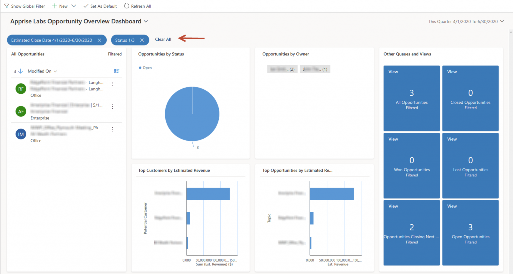
The selected filters will not only impact the records you see in the data stream on the left side, but they will also reduce the data being presented in the charts and in the tiles on the right. Because I selected the “Open” pie slice, it would make sense that tiles for Closed Opportunities, Won Opportunities and Lost Opportunities would all display zero (see above).
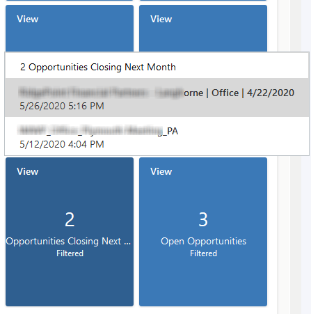
The tile in the lower left corner displays Opportunities Closing Next Month. If you wanted to see which Opportunities fit into that category, you can click into the tile and the records will be displayed. These are also links, so click on a record and the Opportunity record form opens to display all the details about this Opportunity.
Summary
You could imagine that with more data behind these visualizations, these interactive dashboards would be quite impressive. Here is a good link from Microsoft that will provide more details and more available options – Configure interactive experience dashboards. Like I said before, it’s fun to try to anticipate your users’ needs by creating a Dynamics 365 interactive dashboard for them before they even ask for one. Give them a try and have fun!


No comment yet, add your voice below!